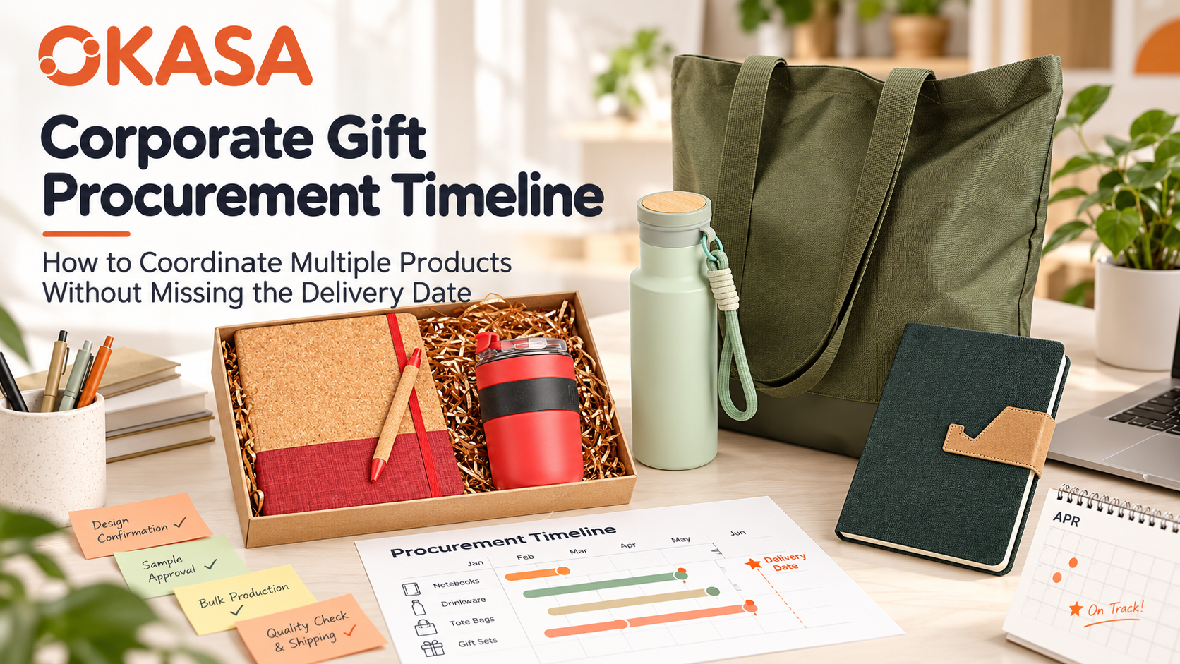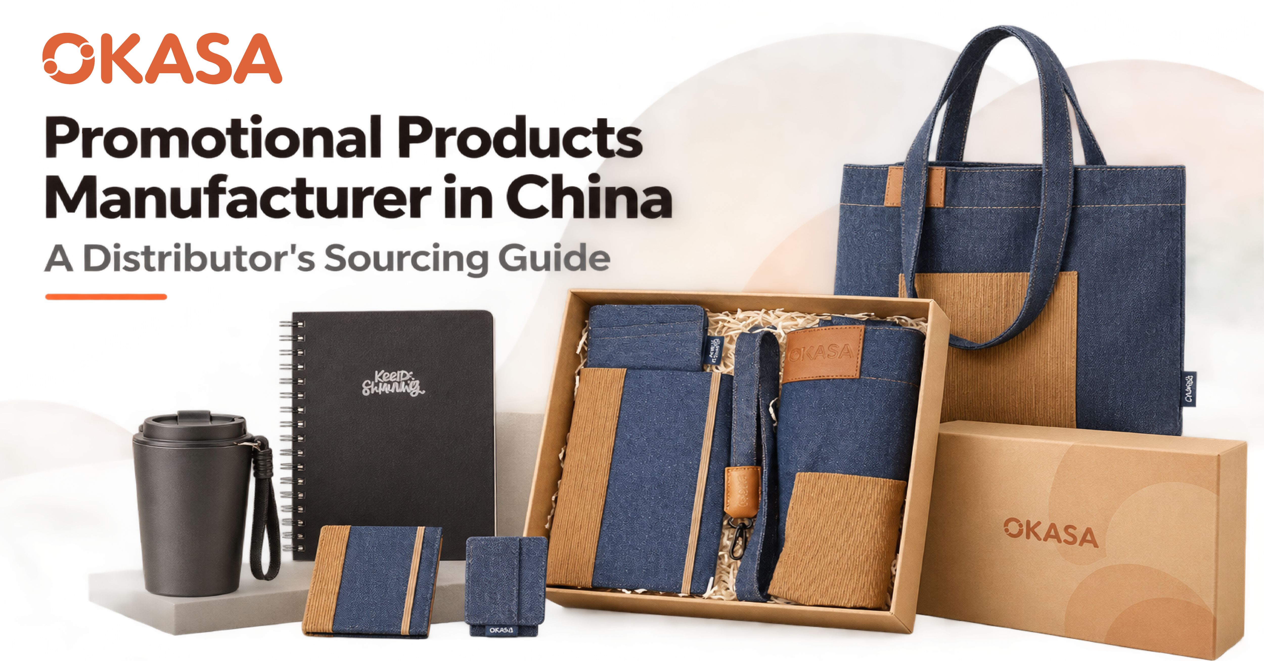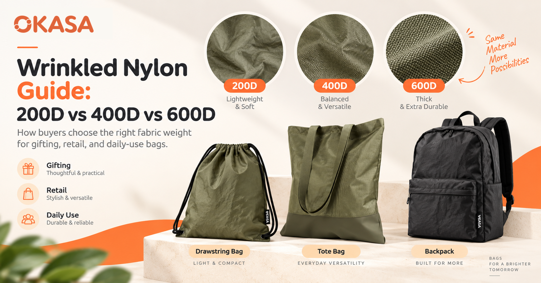


A brand color can look disciplined on a style guide and strangely disjointed when it reaches a real gift set. The bottle appears darker than the approved orange. The nylon bag leans red. The notebook cover looks muted. The printed sleeve seems brighter under office LEDs than it did beside a factory window. None of the suppliers necessarily ignored the brief. They may simply have produced the same color instruction on surfaces that behave differently.
That distinction matters to procurement teams. A corporate gift is rarely judged as four isolated products. It is opened, photographed and handled as one branded experience. When the components do not belong together visually, recipients notice the inconsistency before they understand its technical cause. Marketing sees a weakened campaign. Procurement sees rework, approval delays and arguments about whether a sample is “close enough.”
Sending a Pantone number and hoping for the best is not a solution. Powder-coated steel, dyed cloth, uncoated paper and cork will never behave like copies of one another. Buyers need to decide which surfaces carry the brand color, which ones may sit comfortably beside it, how the comparison will be made and who signs it off.
This guide gives buyers a practical nine-step method. It is intended for regional campaigns, onboarding kits, conference merchandise, customer gifts and other programs that combine several materials in one delivery. The same process also helps a supplier quote more accurately because the definition of success is visible before production begins.
Why One Color Code Produces Several Visual Results
A Pantone reference gives two teams a place to begin their conversation; it does not hand every factory the same paint formula. What the eye eventually sees is shaped by the base material, the colorant, the surface texture, the light in the room and the way the object is tilted.
Imagine putting the same warm orange on four components. Powder-coated steel gives it a solid skin, and the sheen of that skin is immediately visible. Woven cloth breaks the color into yarn, tiny gaps and shadows, so the eye reads a different depth. Linen adds still more texture and can take ink unevenly. Kraft board brings its own brown cast unless the printer lays down an opaque white base. The instruction may be shared; the thing people see is not.
Finish changes the reading too. Gloss throws back hard highlights, which often gives the impression of greater saturation. Matte surfaces spread the light and tend to look quieter. Embossing introduces shadow; clear varnish can deepen ink; laser engraving takes material away instead of laying color on top. These differences are physical, not a convenient excuse offered after sampling.
Then there is the light itself. Two samples that sit happily together by a window may split apart under shop lighting. The technical name is metamerism. It shows up more often when one piece is colored with a dye, another with ink and a third with a coating pigment. If a buyer approves beside a sunny window while the factory works under cool LEDs, both may be acting reasonably and still be judging different evidence.
Color control therefore begins by replacing a vague request—“match our orange”—with a reproducible approval system.
The Commercial Cost of Getting Color Wrong
Color inconsistency is easy to dismiss as cosmetic until the goods are packed. At that point, even a modest correction can touch several parts of the order. A bottle may need recoating. Fabric may require a new dye lot. Printed boxes may need to be remade. Finished sets may have to be unpacked, sorted and packed again. Airfreight booked around a launch date does not wait for that work.
The less visible cost is decision time. If a team has no agreed standard, every sample photograph starts a new debate. The designer compares the item with a calibrated screen. The procurement manager compares it with a previous order kept in a drawer. The factory compares it with a printed fan that has seen years of use. Each person has a reference, yet the references are not the same.
For a global program, inconsistency can also fragment the brand. One region reorders a notebook from last year's file. Another adds a tote through a different vendor. A third requests a bottle using an RGB value copied from a website. Individually, the items may be acceptable. Together, they look like unrelated campaigns.
Good color management does not eliminate every variation. It places the important variations inside a controlled and commercially sensible boundary.
A Cross-Material Color Risk Map
The following table helps buyers anticipate where a nominally identical color is most likely to shift.
|
Component |
Typical color process |
Main source of variation |
Sensible approval evidence |
Buyer’s practical note |
|
Stainless-steel drinkware |
Powder coating, spray paint or screen print |
Coating batch, film thickness, gloss and curing |
Coated metal chip plus finished pre-production sample |
Approve body color and logo color separately |
|
Nylon or polyester bag |
Solution dye, piece dye, transfer print or screen print |
Fiber type, weave, dye lot and heat |
Fabric cutting from the intended mill lot |
A fabric swatch is more useful than a screen photo |
|
Linen or PU notebook cover |
Dyed stock, laminated paper, screen print or foil |
Texture, absorption, stock batch and finish |
Cover material cutting plus bound sample |
Judge color across a useful area, not on one thread |
|
Ivory inner paper |
Mill-made paper shade |
Whiteness, optical brighteners and batch |
Paper stock sample |
Treat page shade as a supporting neutral, not a brand match |
|
Kraft or printed gift box |
Offset, flexo or screen print |
Board color, white underprint, ink density and varnish |
Printed proof on actual board |
A proof on white coated paper is not equivalent |
|
Cork or bamboo detail |
Natural material, print or laser |
Grain, age, moisture and natural tone |
Range sample showing normal variation |
Specify a range; exact uniformity is usually unrealistic |
|
Silicone accessory |
Pigmented molding |
Compound formula, cure and translucency |
Molded color plaque or finished part |
Thin and thick sections can appear different |
This map should be attached to the request for quotation when color is commercially important. It tells the supplier which risks the buyer already understands and which evidence will be needed before bulk production.
The Nine-Step Color-Matching Method
Step 1: Establish One Physical Master Reference
Choose one current physical reference as the source of truth. A recent Pantone guide can serve this purpose when the target is a Pantone spot color. If the brand relies on a proprietary sample—perhaps a retail pack, a molded part or a previously approved product—label and protect that item as the master.
Do not mix references casually. A HEX code describes display color. CMYK values describe a process-color recipe under defined printing conditions. A Pantone code identifies a standardized color reference. A physical item includes its own material and finish. Those references can support one another, but they are not interchangeable.
Record the guide system, code, finish and year or condition of the physical fan. A coated Pantone reference and an uncoated reference can look different. Old guides fade, especially after prolonged exposure to light. When the program matters enough to debate a small shift, it matters enough to use a current, well-kept standard.
Send the master, or a carefully controlled duplicate, to the lead supplier when practical. When each side keeps its own guide, compare their type, age and condition before samples are judged. Keep photographs for placement notes and quick progress reviews; do not let a phone image quietly replace the physical standard.
Step 2: Write Down Every Surface and Finish
List every visible component, its material, its base color and its finish. This schedule turns an aesthetic ambition into a production brief.
For drinkware, state whether the body is powder coated, glossy painted or left as bare steel. For a tote, name the fiber, fabric construction and finish. For notebooks, distinguish the outer cover, elastic, ribbon, pen loop and inner paper. For the gift box, state the board type, lamination or varnish, insert material and any exposed kraft surface.
The schedule should also identify the process that creates the brand color. A bottle body color, a screen-printed logo and a silicone loop may need three different production recipes. If they are described merely as “Pantone Orange,” the supplier has not received enough information to control them.
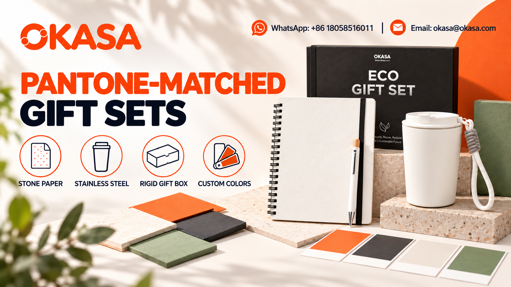
This is the stage at which an experienced custom corporate gift set manufacturer adds value. The TGS916, for example, combines a recycled stone-paper PE soft-coil notebook, a stainless-steel cup and paper-based presentation materials. The supplier can flag impossible combinations early: a metallic foil cannot behave like flat ink, an uncoated paper surface cannot reflect light like powder-coated steel, and a dark substrate may need an underbase before a light logo is printed.
Step 3: Decide What Must Match and What Should Coordinate
Not every colored area deserves the same tolerance. Rank the components by visual importance.
An effective hierarchy usually has three levels. The anchor color is the most recognizable brand expression, such as the bottle body or the large printed face of a box. Primary companions should appear very close to the anchor when the set is viewed normally. Secondary accents may intentionally use a lighter, darker or more muted version of the color.
This distinction prevents an expensive pursuit of theoretical sameness. A textured tote can coordinate beautifully with a smooth bottle without pretending that their reflectance and gloss are equal. In fact, a deliberate tonal family often looks more refined than several materials forced toward a match they cannot sustain.
Write the hierarchy into the brief. For example: “Bottle body is the anchor. Box print should be a close visual match. Notebook elastic may be one controlled shade darker. Natural cork is exempt from color matching but must remain within the approved material range.” Such language gives the factory a usable target and gives the approver a consistent basis for judgment.
Step 4: Set the Viewing Conditions Before Reviewing Samples
Color approval requires a shared environment. At minimum, agree on the main light source, the secondary check and the neutral background. Professional graphic and product workflows often use standardized viewing conditions; the exact setup should reflect where the gift will be seen.
For most corporate merchandise, start under controlled neutral light, then carry out a second check in an ordinary office or in indirect daylight. Lay the pieces on gray or white. A red wall, several lamps burning at once or a shaft of direct sun will skew the decision. After moving to another light source, wait briefly before calling the match.
Look at the components as a set, then pull them apart. The grouped view answers the immediate question: does this feel like one program? The individual view can expose a thin patch of coating, a change in ink density or one fabric panel that came from the wrong roll.
When taking photographs, place a neutral card and the master swatch beside the sample at the same angle. Even then, the phone chooses exposure and white balance on the user's behalf. The image is a record and a useful way to spot an obvious miss, not the final judge. If brand color matters, sign off the physical piece.

TGS916 stone paper, powder-coated metal and packaging samples arranged for color approval.
Step 5: Use a Sample Ladder, Not One Last-Minute Sample
A controlled program advances through evidence in stages. The exact names vary between factories, but the logic is stable.
First, review readily available materials and process references. These may include powder-coating chips, fabric cards, notebook-cover cuttings and printed board examples. They quickly show whether the requested direction is feasible.
Second, request customized component samples for high-risk items. A lab dip or mill cutting can confirm fabric direction before bags are sewn. A sprayed metal chip can confirm coating before a finished bottle is assembled. A printed proof on the intended board can reveal how the substrate affects ink.
Third, approve a complete pre-production sample made with the intended materials and decoration methods. This sample tests the relationship between color, form, logo, construction and packaging. It should be signed, dated and retained as the production standard.
Fourth, inspect a small number of early production units when the schedule and process permit. A perfect hand-made sample does not automatically prove that the first bulk coating or dye lot is stable. Early units provide a chance to correct a process before the entire order is finished.
A custom notebook manufacturer may need to approve the recycled stone-paper cover, PE coil, elastic and inner sheets as separate components before binding. A custom drinkware manufacturer may control coating, lid plastic, hanging loop and printed decoration through different upstream processes. The sample ladder brings those streams together at the right time.
Step 6: Approve Tolerances in Plain Language and Measured Terms
“As close as possible” is not a tolerance. It invites disappointment because every reviewer interprets it differently.
Where instruments and stable surfaces allow, the supplier may use color measurements such as L*a*b* values and a Delta E comparison. Those readings can help monitor a coating or print process, but the method, instrument settings, geometry, illuminant and measurement location must be consistent. A number collected from smooth metal should not be treated as directly equivalent to a reading from coarse woven fabric.
Measured limits work best when paired with an approved visual sample. The signed sample shows the whole appearance—hue, lightness, saturation, gloss, texture and normal production character. The measurement helps detect drift within a comparable process.
For materials that are difficult to measure reliably, define a visual range. Approve a light boundary, a target and a dark boundary when possible. Natural materials deserve explicit range approval because grain and base tone are part of their appeal. The buyer can reject pieces outside the range without demanding artificial uniformity inside it.
Record any exceptions. If the silicone loop is allowed to be slightly lighter than the bottle or the recycled fabric includes visible flecks, put that fact on the approval sheet. A short written note prevents a forgotten conversation from becoming a dispute weeks later.
Step 7: Lock Materials, Recipes and Production Batches
Once the sample is approved, freeze the variables that created it. The supplier should record coating reference, fabric mill and lot, ink formula, board stock, varnish, molding compound and other critical details. If a change is unavoidable, it should trigger a new review rather than a silent substitution.
Batch planning matters. Producing all units from one dye lot or coating batch reduces within-order variation. When the volume requires multiple batches, the factory should compare each batch with the signed standard and, ideally, with the neighboring batch. Components made at separate locations must arrive early enough to be checked together.
The same principle applies to decoration. A logo printed at the start of a shift should not gradually drift as ink viscosity changes. Operators need an accessible reference and a defined frequency for checks. Production records should identify which units came from which batch so that an isolated issue can be contained.
An OEM promotional products manufacturer coordinating several categories should provide one color-control owner. Buyers should not have to arbitrate independently among a bottle factory, a sewing factory and a printer. One accountable coordinator can distribute the master, collect samples and confirm that the assembled program follows the approved hierarchy.
Step 8: Inspect Color in a Repeatable Way
Inspection should answer three different questions. Does the shipment agree with the approved standard? Is color consistent within the shipment? Do the components coordinate correctly when assembled as a set?
Select samples across cartons and, when known, across production batches. Do not examine only the cleanest unit from the top of one carton. Place the signed sample beside current production under the agreed light. Check representative front, side and decorated areas. Rotate glossy items to distinguish color difference from reflection.
Look for more than hue. Coating thickness, orange peel, pinholes, fabric panel variation, uneven ink coverage, scuffing and glue marks can change the perceived color quality.Inspect packaging after normal handling because abrasion may reveal a lighter base on folds and edges.
Use instruments for comparable surfaces when the approved plan requires them, then retain photographs and readings with the inspection report. The final decision should still consider how recipients see the assembled product. A technically small shift on the largest surface may be more noticeable than a larger shift on a tiny accessory.
Step 9: Protect Color Continuity for Repeat Orders
Reorders fail when the buyer sends an old artwork file but not the evidence that made the previous order successful. Keep a color archive with the signed master, supplier codes, material names, finish descriptions, photographs, measurement settings, approved range and a production sample stored away from heat and light.
Before a repeat order, compare the archived standard with a fresh reference. Some materials age. Paper yellows, fabrics fade and coatings change after use. The archived item should be a protected control, not a product that spent a year on a sunny office shelf.
Ask whether any upstream material or process has changed. A discontinued fabric, updated coating chemistry or new board mill can require fresh sampling even when the Pantone number remains unchanged. Reapproval is cheaper than assuming that a written code recreates an entire physical history.
For long-running programs, agree on a change-notification rule. The supplier should disclose material, source and process changes before production. This discipline is particularly important for organizations that distribute gifts across several regions or reorder at different times of year.
How the Method Changes by Product Category
Powder-Coated Drinkware
Drinkware often becomes the anchor because its colored surface is large, smooth and visually dominant. Yet the curved body creates highlights, so approve it by rotating the product under controlled light. Compare an area away from sharp reflections. Confirm gloss as well as hue; a matte and glossy coating made to a similar color reading can look unrelated.
Also separate body color from decoration. A white logo printed on orange needs sufficient opacity. A dark logo may shift with ink thickness. If the lid or loop is colored, approve it as a companion component rather than assuming molded plastic and coated steel will match automatically.
Woven Bags
Fabric structure makes color lively but difficult to judge from a small digital image. Request a cutting large enough to see the weave and fold it as the finished bag will fold. Examine both flat and shadowed areas. Confirm that production comes from the approved mill lot, especially when the same gift program will be packed over several weeks.
A capable custom bag manufacturer should identify the fiber, denier or construction, dye route and relevant lot. Handle trims separately. Webbing, zipper tape, sewing thread and coated panels may each use different suppliers. A coordinated bag can look intentional even when those materials are not identical, provided the hierarchy is approved.
Textured Notebook Covers and Paper
Notebook color has two personalities: the outer cover and the page block. Linen scatters light; PU may have a grain and sheen; laminated paper can be very smooth. Ask to see the chosen cover material before binding because a completed sample is slower and more expensive to revise.
Page shade affects the set even when it is not a brand color. Bright white paper creates a crisp contrast. Ivory paper produces a warmer, quieter impression. Specify the paper shade and weight alongside the cover so the finished product supports the intended palette.
Printed Gift Packaging
Packaging surrounds the products and can amplify a small mismatch. Print proofs must use the intended substrate and finishing stack. A color proof on bright white coated stock will not predict the same ink on kraft board. If a clean brand orange is required on brown board, discuss an opaque white underprint or a separate label rather than discovering the limitation after the boxes are cut.
A custom gift box manufacturer should confirm board, print process, lamination or varnish and visible interior surfaces. The TGS916 lid-and-base presentation uses greyboard laminated with kraft paper, which makes the board color part of the approval rather than an invisible construction detail. The box does not always need to match the cup exactly; a controlled logo on a neutral structure can be more reliable than flooding the entire surface with ink.
When the Material Is Meant to Vary
Cork is not flat-colored plastic, and bamboo does not arrive with identical grain from piece to piece. Recycled cloth can also show flecks or small shade movements. Those details are often the reason a designer selected the material in the first place. Sorting out every harmless difference creates waste and works against the story the product is supposed to tell.
A sustainable promotional products manufacturer should help define which variation is normal and which indicates a process problem. With recycled stone paper, for example, the cover and inner sheet should be reviewed as real production materials rather than judged from a bright digital mock-up. Ask for a range board rather than one perfect sample, then show the normal surface character to internal approvers before bulk production.
A Practical RFQ Table for Color-Critical Projects
Include the following information when requesting a quotation. Clear input improves both price accuracy and sample speed.
|
RFQ field |
What the buyer should provide |
Why it matters |
|
Master color |
Pantone system/code or labeled physical reference |
Establishes one source of truth |
|
Product list |
Item, material, size and quantity by destination |
Reveals the number of color processes involved |
|
Anchor component |
The surface that defines the visual target |
Guides cross-material decisions |
|
Surface character |
State whether it is matte, satin, glossy, metallic, raw or textured |
The eye reads the finish together with the hue |
|
Match hierarchy |
Must match, close companion or intentional accent |
Prevents unnecessary resampling |
|
Viewing condition |
Main light and secondary real-world check |
Aligns sample decisions |
|
Tolerance method |
Signed sample, range board and/or measured limit |
Defines acceptance before production |
|
Sample stages |
Material chip, component sample, pre-production sample |
Protects the schedule from late changes |
|
Delivery plan |
Event date, destinations and packing sequence |
Allows time for approval and correction |
|
Repeat-order need |
Expected reorder window and archive requirements |
Supports future continuity |
For promotional products sourcing China, include the table in the initial brief rather than adding color requirements after price approval. A low quotation based on stock colors cannot be compared fairly with a quotation that includes custom dyeing, sprayed chips, printed proofs and documented batch control.
How to Evaluate a Supplier’s Color-Control Capability
Ask for an explanation of the process, not a simple promise that the factory can match any Pantone. Strong suppliers describe how they translate the master across materials, what samples they will provide, how they retain signed standards and what happens if a production batch moves outside the approved range.
Useful questions include:
· Who owns color coordination across the component factories?
· Which items require a custom recipe, and which use the nearest stock color?
· Will proofs be made on the actual production substrate?
· What viewing conditions are used for approval and inspection?
· Can coated surfaces be measured consistently, and with what settings?
· How are fabric dye lots and coating batches identified?
· What material variation should the buyer expect?
· How is the approved sample stored during production?
· What change requires resampling?
· What records remain available for a reorder?
A credible promotional products manufacturer China will sometimes challenge the brief. That is a positive sign when the objection is specific. For example, the supplier may recommend a tonal elastic instead of claiming it will perfectly match a linen cover, or suggest printing a white base under orange ink on kraft. Technical honesty before sampling is more valuable than effortless agreement followed by delays.
Building a Coherent Gift Set Without Forcing Identical Color
The best sets treat color as a relationship. Pick the surface that leads, bring one or two important companions close to it, and allow a neutral or natural material to break the repetition. Picture a sage bottle with a forest-green linen book, an olive bag and an unprinted kraft box. No two readings will be identical, yet the group plainly belongs to one idea. A small orange logo repeated on each item may be all the connection it needs.
Texture can become an asset. Smooth powder coating, woven fabric, fibrous paper and cork create contrast that feels deliberate when the palette is limited. Trying to conceal those differences can make the project look synthetic and increase the number of custom processes.
This approach is useful for bulk corporate gifting solutions, where cost, lead time and consistency must work across many units. Reserve the tightest control for the surfaces recipients notice first. Use coordinated stock materials for smaller accents when they meet the visual goal. Spend sampling time where a mismatch would genuinely weaken the brand.

A buyer compares the TGS916 cup, stone-paper notebook and packaging proof under controlled and natural light.
Common Approval Mistakes—and Better Alternatives
Approving From a Screen Alone
Screens differ in brightness, calibration and color gamut. Camera processing adds another layer. Use digital images for direction and progress checks. Approve important color with a physical standard.
Comparing Samples Under Mixed Light
Ceiling LEDs plus daylight plus a warm desk lamp create an unstable judgment environment. Switch to one agreed source, use a neutral background, then perform a deliberate secondary check.
Treating Every Surface as Measurable in the Same Way
Instruments are powerful on stable, uniform surfaces. Texture, transparency, curvature and sparkle complicate readings. Match the method to the material and retain visual range standards where measurement is unreliable.
Forgetting Gloss and Texture
A glossy piece and a matte piece can look surprisingly far apart even when their underlying hue is close. Put finish into the specification and approval, not just the color code.
Approving One Perfect Unit
An exceptional sample does not describe the allowed production range. Review multiple units or a range board for variable materials, and inspect early bulk output.
Changing Material After Color Approval
A switch in fabric, board or coating system invalidates the previous result. Require disclosure and reapproval when a critical substrate or process changes.
Using Old Products as Unlabeled Masters
A used or sun-exposed item may have changed color. Keep protected control samples, label them clearly and record the approved production details.
A Buyer’s Final Pre-Production Checklist
Before authorizing bulk production, confirm that:
· one physical master reference is identified and available;
· every visible substrate and finish is listed;
· the anchor color and companion hierarchy are written down;
· viewing conditions are agreed;
· high-risk materials have been sampled on the intended substrate;
· the complete pre-production sample is signed and dated;
· acceptable ranges and exceptions are documented;
· production material sources, lots and recipes are locked;
· inspection sampling covers cartons and production batches;
· reorder records and retained controls have an owner.
If one of these points is missing, pause long enough to resolve it. Color decisions become more expensive after components are assembled.
Questions Buyers Usually Ask
Will every material reproduce one Pantone color exactly?
Usually not. Steel, cloth, paper and cork send light back to the eye in their own ways, and the colorants used on them are rarely the same. A sound program creates a controlled visual family and records the variation that cannot sensibly be removed. Numerical limits are most useful when the buyer is comparing like with like: the same process on the same kind of surface.
Is a Pantone code enough for a supplier quotation?
It is a useful start, but not enough for a color-critical multi-product program. The supplier also needs the Pantone system, target finish, substrate list, match hierarchy, sample stages, quantities and delivery deadline. Custom matching may affect minimum order, sample cost and lead time.
Should we approve color from factory photographs?
Photographs are suitable for progress review and obvious error detection. They are unreliable as the sole final standard because cameras, lighting and screens alter appearance. Approve a physical sample when brand color is important.
What is the best master component for a gift set?
Choose the component with the greatest brand visibility and the most controllable surface. A powder-coated bottle or a large printed packaging panel often works well. The choice should reflect the campaign design, not a fixed rule.
Do recycled materials require wider tolerances?
Often they require a clearly described visual range rather than a vague wider tolerance. Recycled fibers, flecks and mixed feedstock can create normal variation. Review representative samples and agree which characteristics are acceptable before production.
How many sample rounds should we plan?
Plan by risk rather than using one number for every project. A stock-color item may need a standard sample and a decorated pre-production sample. A custom-dyed, multi-material set may require material references, customized components, a complete pre-production sample and early production checks.
Can color measurement replace visual approval?
No. Measurement can make process control more consistent, especially on smooth, opaque surfaces. Visual approval remains necessary because recipients perceive color together with gloss, texture, shape and surrounding materials.
How should we manage colors across several factories?
Appoint one supplier or project owner to distribute the master, coordinate samples and retain the signed standards. Require all component factories to work from the same hierarchy and viewing instructions. Review assembled samples, not only isolated components.
What should be stored for a reorder?
Keep a protected approved product, master swatch, material references, process and finish details, supplier codes, batch information, photographs, measurement settings and written exceptions. Confirm changes before repeating production.
When should color matching start?
At RFQ stage. Early decisions influence material availability, sampling, minimum order and production timing. Starting after the purchase order usually compresses approval time and increases the chance of compromise.
Make Color a Controlled Procurement Decision
A coherent corporate gift program is not created by repeating one code in every purchase-order line. It is created by translating brand intent into material-specific standards, reviewing those standards under shared conditions and preserving the evidence from sample to shipment.
The nine-step method is straightforward: select one physical master, map every substrate, set a hierarchy, control the viewing environment, use staged samples, define tolerances, lock production inputs, inspect repeatably and archive the result for reorders. Each step removes a familiar source of ambiguity.
OKASA coordinates drinkware, notebooks, bags, gift packaging and assembled sets for buyers who need more than isolated custom products. As a custom corporate gift set manufacturer, OKASA can help translate one brand palette across different production processes while keeping sampling, packing and delivery decisions connected. For programs requiring a broader OEM promotional products manufacturer, the same documented color-control approach creates a more reliable path from design intent to bulk goods.
Ready to Build a Color-Consistent Corporate Gift Program?
Share your quantity, market, deadline, artwork and preferred specification with OKASA.